Another 2 sessions, each 3 hours long, with Colin Pethick. I’m really beginning to struggle with concentration now as a result of lockdown, and along with our terrible internet connection, this has made it almost impossible to follow with any care so my end result really isn’t doing the teacher justice.
However I still learnt odd things just by listening so it’s never a waste of time:
Watch out for mixing with opaque blacks which, like titanium white, are too dominant and solid for this. Transparent black acrylic = Ivory Black (I now have some). My Daler Rowney black is opaque *** Good subs would be Paynes Grey or Mars Black.
Rigger brushes = long thin pointed brushes. Much longer hairs than usual so that when pressure is put on point the tip does not split and separate but stays a sharp point (as used for painting ships rigging)
Grey is mixed using complementary colours with white eg blue and orange, yellow and purple. (Red and green tends to give a muddy brown as there’s more red in it.)
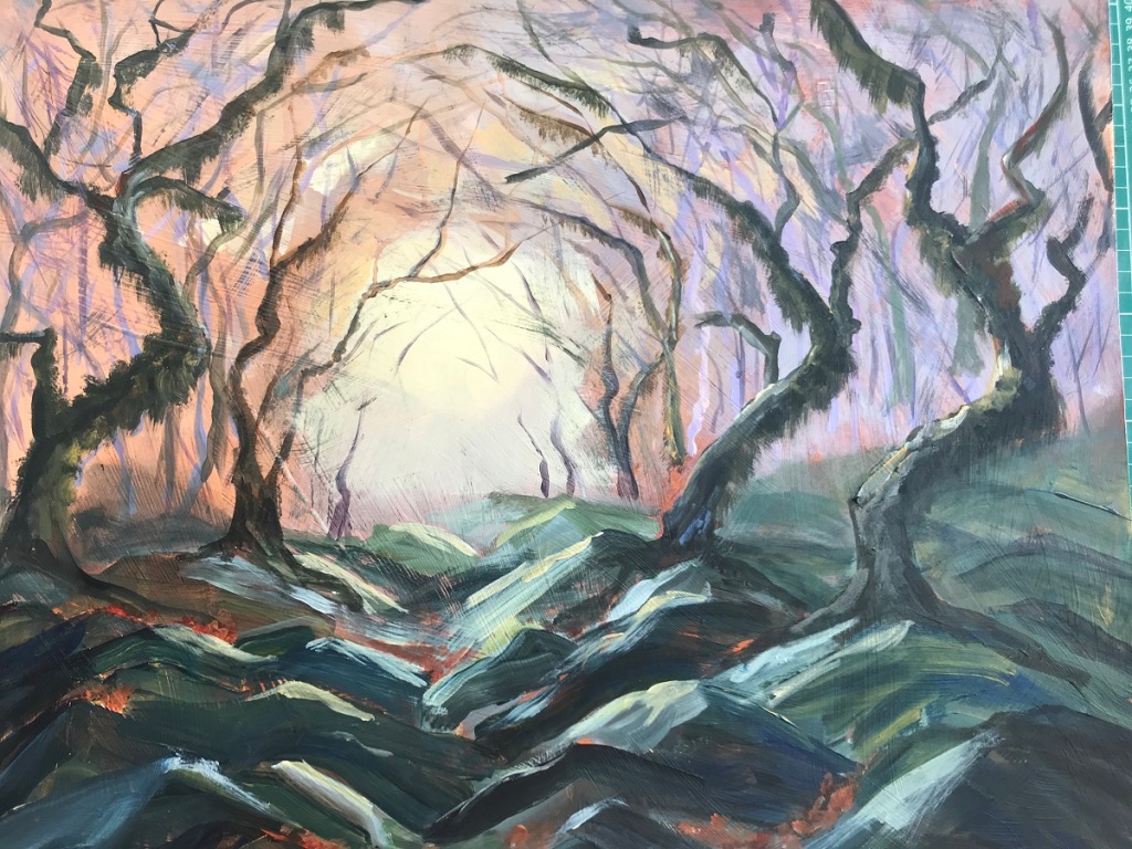
Needs a lot more work but surprisingly good start. Atmosphere of gloomy woodland with sun coming through trees is beginning to come. More trees needed, especially in centre distance. Alternatively lead up to that circular vortex with a path or clearing rather than mossy rocks. My colours are perhaps a little too vibrant for this and should be more grey and less orange/purple. Tried painting rocks very loosely and just concentrating of getting light/dark tones in the correct places.
Objective: To create a snowy woodland scene showing shadows in the snow.
Background first: Wetting paper so paint runs to give effect of distant forms. Drying and then adding payers with more detail, darker tones as become nearer.
Larger trees: choose light/dark sides. Paint applied with side of dry brush so scratchy and leaves white areas.
Snow shadows: varying tones, keep wet so blends out. Dark lines to show folds in ground and give form. Add hints of branches and roots poking through snow.
Pleased with this but looking at it now I needed to be clear about which direction to low winter sun was coming from, or maybe it’s just from behind through the trees? Needs more of the far distant foliage really to give a woodland effect. Just used 2 colours: Ultra Marine Blue and Burnt Sienna which keep it simple and wintry (when there a lack of colour generally). Could have splattered with white spots when dry to seem like it’s snowing…
21st February, half day:
Snowdrops in snow.
Drew snowdrops lightly with pencil and then used masking fluid to block them out so that areas are left white when background done.
Lots of water then Phthalo blue, Ultramarine, Rose Madder, Violet allowed to run. Keep edges clear. Make sure dark colour around flowers to make them more striking.
Dry then remove masking fluid.
Shading to flower petals in violet and bit of green (phthalo + lemon yellow)
Snow shadows with violet.
Flower petals worked well and look delicate / realistic. Background is OK but rather messy – I kept tipping the paper in all directions but should have left it for longer in just a few so that it had a chance to run out.
Snow would have been better given more time but it was a rush at the end! Messy bottom corner unfortunately. Good techniques learnt thought using the masking fluid. Definitely need to practice letting the paint run and blend without mushing together.
Painting student meet up in Maiden Newton on 29th January 2020.
Another great opportunity for me to pick the brains of these 2 students with regard to painting techniques, work critique and OCA questions in general. Whilst these two students are both painters, their work is as different to each other as its possible to be which is an added bonus! Student J is a talented traditional painter using mainly oils and water colour on a huge range of surfaces (paper, board, transparent sheets, fabric, wood…) and from tiny to large hangings. Very interesting to see her vast range of work for her final modules and discussed ways to display and mount. Student S is very contemporary, working a lot with moving image (eg videos of abstract painted shapes suspended on a mobile. edited, manipulated, put to sound…). So interesting to see ways that painting doesn’t have to be in the traditional style on paper/canvas.
Mount work for assessment on WHITE mount board – assessors prefer that to black. When it comes to my next assessment, take all work along and they will help me choose pieces that work together on a theme and help with presentation – it’s hard to know exactly what OCA want! At this stage, I’m thinking that my connecting theme could a ‘colour’.
Discussed my Fauve Portraits for part 3 and also View from window for Part 4. Suggestions of more artists to look at:
Howard Hodgkins – fauve/mark making
Peter Blake – British POP artist
David Hockney – later portraits to look at colour
Ben Nicholson – view fm windows
Sladers Yard in West Bay hold good exhibitions worth visiting
Student J summer exhibition:
11th and 12th July at Old School Upwey, also all of August at King Combe Centre, DT2 0EQ
SW Study Group meeting in Bristol, 8th February 2020
With OCA Visual Communications tutor Stephen Monger. Morning workshop focused upon producing a poster to fit a brief
Split into 2 groups: Conformist and Non-Conformist. Posters produced by the Conformist group are in the top line above and the Non-Conformist are the lower line. Strangely the most non-conformist are in the top line with additional writing, images cut up, extras added etc. Very interesting to see how every student tackled this differently with some things working and others definitely not.
Fonts to use – use San Serif fonts for posters (ie without the flicks) and choose one that has lots of versions as they are more likely to be professionally created. Never use 12 pts as it looks like you can’t be bothered to edit to the most appropriate!
Useful Apps:
‘In Design’ very professional, lots of options, easy editing and rotating etc
‘Canav’ – free app with templates, more for the infrequent maker.
Peer Critique in afternoon, a few that particularly interested me:
Ann: Tunnel Book – gradually reducing circles cut into identical photos and then put together with spacers between so that it looks like a tunnel. Looking through time. As it’s a book, the edges are made with concertina folds, a cover will be added together with title, blurb etc. Could be done as a sculpture instead eg using spacers to separate the photos, and no cover. Another fabulous idea for ways of displaying work. Similar to the layer paintings of Anthony Green and could certainly be adapted to painting. Also see blog by artist Shona Grant for details on construction methods.
Paddy : ‘Book as a selfie’. Instead of photos of herself, she chose to make a book for her photos that spoke to her in a variety of way. On alternate pages were quote (not her own) which were sometime relevant to the opposite photo, sometimes not. All B&W to show a feeling of being alone.
Comments were very positive of the photos which grabbed your interest. With regard to book construction: it seems rather a dated style with text pages, following each photo displayed with white border. Tutor suggested perhaps a more modern style – no white borders, no page numbers (why are they necessary?), place all quotes together so as not to distract from photos…
Liz: Layered landscape (photography). Landscape photos printed and folded geometrically, rephotographed and printed, placed into landscape and repeated again and again. Folds are tight and crisp = controlled, but the overall effect is un-controlled.
Video of the print in the landscape, some being manipulated by hands or moved showing body too – should she use sound, clips longer/shorter, on loop… separate between clips with/without body as they have a different feel. Could sound over complicate it? the tricky part has been the folding so now keep it clean and simple.
Tutor Lydia Halcrow spoke to the group about her work:
Uses metal plates attached to her walking boots to collect the marks from her walks along the estuary. She used these scratched and grooved plates to then print images of each walk.
Initially her work was painting of an area. Now her work is a response to an area – collected soil used as painting medium, found clay used to take imprints in ship hull which collects barnacles and rust.
Mild steel plates left to rush on the ships hull
Works on collections of small pieces which can be displayed together in grids to made large pieces.
Collects found plastics from beach and arranges on light sensitive plate (from China) which leave rough areas that can then be printed – black images (using found black clay for ink) on thick white paper (like blotting paper), some plastics identifiable (ring pulls, netting)
We then discussed the problems of working outside and ways we’ve found to overcome these:
People looking and possibly asking questions! Lack of self confidence – join a small group of artists working so focus isn’t on you, work small and simply then rework back in studio. Have your story ready to tell the inquisitive (student working on project, council worker)
Personal safety, being alone (especially for photographers) in dark areas – the usual check list of tell someone where you’re going and when you’re expected back, take torch, take dog, go with someone…
Ever changing light and weather conditions – work small and quickly, don’t let it worry you, just adjust, go prepared to change from painting to rubbings or soil collection, quick sketch or photos
Trespass – know your local law, don’t try photographing government buildings in Israel etc, ask permission on obviously private land (or work quickly)
Carrying supplies – don’t take everything, keep it to a basic minimum, use pastels, charcoal or brush pens rather than paints etc
The afternoon was spent with student presentations and questions regarding their current work. As there were 19 students, we split into 2 groups of 9 so that we had approx 15 mins each. I presented my pieces for Part 2 assignment and asked what worked well/didn’t with each as they are so different. Interesting feedback from fellow students and Lydia Halcrow – see Part 2 assignment write up.
A very enjoyable and useful session despite being such a long distance to travel there and back in the one day. Always great to meet up with other students to swap stories and gather advise.
Weekend course learning some basic pottery techniques. Shown the technique and then everyone made their own designs. I made 2 vases, attempting to get same design but different sizes (easier said than done):
30cm high
15cm high
Shape of my first taller pot was better – round bulbous base, tapering to vertical neck with small frilled edge. My second try at repeating the same form has different proportions – wider neck and much wider frill.
Made an assortment of flowers and seed pods to go into the vases. Once fired I will thread metal rods (or perhaps canes) through the pod holes and secure above and below with nuts, and on the flat flowers I will glue the rods onto the backs.
Colours: all to be quite natural – vases dark brown and flowers assortment of yellow and orange.
Waiting for the clay to totally dry before firing and then glazing…
Thank you to Jane Coxhill (final year Painting) for inviting me to her studio for an Acrylic Mediums and Painting Materials help session. Also Sue Parr (Painting 2) and Diane Goring (Painting year 1).
Advise regarding my Assignment 1 piece of teapot, lemon and flowers:
To make yellow flower opaque so that base colour doesn’t show through – paint area white first and let that dry, then do the yellow (I had been mixing the white into the yellow paint). Jane demonstrated both methods and showed how well the yellow could cover over white.
Another method for this style would be to paint the ground then paint all the darkest tones of all objects, then all the lightest tones of all objects, then gradually work on mid-tones till all done. This method keeps the focus on the tones you see rather than the objects themself.
The only yellow acrylic that is opaque is Cadmium Yellow (as is Cadmium Red), all others will show base layers through – I hadn’t realised this.
I should practice sketching the teapot, focussing on the ellipses and lines that connect parts (eg straight line from handle to spout, line from center of top hole through to centre of base circle). Yes now they’ve points out these distortions I can see how practicing the shape first would have been rather a good idea!
Best Mediums, Supports and Paints to use:
Golden Acrylic Glazing Liquid, Satin – esp. good for dark colours/shadow. Use as a glaze when mixed with paint. Slows the drying time also and makes blending easier.
Liquitex seems to be the best quality acrylic to buy (and worth the money)
Titanium White = best for mixing with colours to make opaque as it has the most pigment. Normal mixing white has far less pigment and is semi transparent – I’ve probably been using normal white!
Matt medium – acts like a glue when doing collage. Better than using PVA as it doesn’t dry with a glossy finish. Can be painted over as normal. Limited use for actually mixing with the acrylics. Jane showed example of a collage using Matt Medium.
Gloss Medium – as above but it’s obviously glossy. Use mixed with acrylic paint to give a glossy finish or as a final layer varnish.
Acrylic will stick to almost anything without priming. However a coat of gesso/cheap white acrylic paint will give a smoother surface to paint on and allow the paint to move better. Try: pieces of cut wood/bark, hardboard, canvas, linen (light or heavy), Polydraw paper (and assorted diffuser papers), normal cartridge paper (stretched and with gesso), stones…..
SAA Practice Paper has a good smooth surface for acrylics which can glide over it better than the water colour paper I’ve been using.
Open Mediums – keep the paint fluid and workable for longer.
To keep un-used paint workable for longer, perhaps overnight, try: find a thin plastic box with fitted lid, put in couple sheets white kitchen roll, wetted, cover with piece of baking paper or similar and use that as your pallet. Close lid when finished and it should keep a while. Acrylics are hard to remix to the same tone as, unlike oils, they dry a different colour.
Try mixing the paint ON the paper rather than pallet – useful for example with water as you get a range of colours rather than just the blend
Try using acrylic inks together with acrylic paints – different consistencies work great together
Harvard Referencing app = PaperPile. Automatic record, OCA approved, easy to use.
Very useful session especially for me, thanks to the other students for spending the time.
Eleven students attended from various disciplines and study levels making it a very all round informative afternoon. (3 x new textiles students, 1 x foundation drawing, 3 x POP1 (including myself), 2 x creative arts level 2, 1 x completing photography level 3, 1 x painting level 2)
Zotero – Harvard referencing software supported by OCA. Recommended by a couple of students who said it is easy to use (several helpful videos) and does all the referencing for you in the correct way. Definitely something for me to investigate as I’ve been wondering if my referencing is up to scratch especially as I progress further.
Sending work for Formal Assessment – refer back to confirmation email when registered for requirements. Remember to guide assessors through parts you want them to see showing progression and learning. Use colour coding. GDrive will arrive end August – complete thoroughly.
I showed my progress so far in POP1 and the tonal studies on White and Dark Grounds. Questions I asked:
What mediums should I be looking into? eg gloss medium for bottle glass to make shiney and contrast with pepper? A= There are 100s to choose from and it’s personal choice. Try: Zest-it, Galkyd by Gamsol (makes drying quicker), Open mediums will help Acrylics to blend, Flow medium, Liquin Gel (for oils) to help flow…. the list is endless. Sue volunteered herself and another experienced student to spend an afternoon showing me their own stocks and what each does – fabulous!
Would they advise using Oil paints as well as Acrylics (I don’t have any currently)? Would I need expensive ones or will cheap do? Yes, try out both but remember they have different qualities. Oils are easier to blend but can take ages to dry. Cheap oils are fine to use – try Georgian Oils which a couple of students use. Also Artizan Oils by Windsor and Newton, which are water based oils (can wash brushes with water rather than turps and doesn’t have strong chemical smells).
Canvas v Paper? Diane used canvas for the important pieces but general consensus was that quality thick paper was more appropriate – look into ‘Canvas Papers’ and special Acrylic or Oil papers
What about watercolour? Sue said the reason watercolour isn’t mentioned is that there used to be a separate unit just for watercolour but that has been withdrawn now – fine to also include it when appropriate but remember it has different qualities/workings.
Four afternoon sessions introducing various mixed media techniques for land and seascapes. See sketchbook.
Using Anilinky and Bleach:
2. Anilinky, acrylics, bleach and scratching with piece of credit card:
3. & 4. Adding textures:
This image is with textures added for a moorland scene. (Wallpaper, tissue paper, flour & acrylic) I think I may have over done the amount of texture a bit – lets see how it looks when the acrylic paint is added next week…
hmmm, useful exercise for practicing but hasn’t worked too well. Too much texture – need to put more thought into placement.