
Chiaro = light in Italian
Scuro = dark in Italian
The use of a bright light source to show great contrasts between light and dark tones. Creates a focal point of that main object and gives depth.


Figure 3 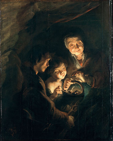
Figure 4
- Figure 1 = Caravaggio, Supper at Emmaus. Light source from upper left side leaving foreground figure in darkness and making the central focus the two animated figures to the right.
- Figure 2 = Tintoretto, Portrait of two Senators (1570). The light source here is used to define the folds in the rather dark robes and gives weight to the fabric.
- Figure 3 = Tintoretto, self portrait. Light source is only slightly to right beside artist/viewer and means that the tones and shadows on the face are almost symmetrical. Lightest tones are on forehead and nose which makes them the focus along with the dark eyes.
- Figure 4 = Peter Rubens, Old Woman with a basket of coal. This is, I suppose, a realistic scene with the only light coming from the fire on a dark evening. Focus becomes the old womans weathered and textured face as she stares at the light.
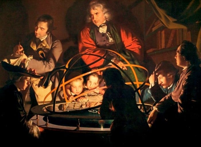

- Figure 5 = Joseph Wright of Derby, The Philosopher Giving that Lecture on an Orrery (1762). Almost photographic in quality. The light in this case is the ‘sun’ within the animated universe. It gives most detail to the children nearest the center but also extends into the far room. Foreground figure is just a silhouette.
- Figure 6 = Rembrandt, Self portrait (1657). Small light source that only illuminates a small area of his face and doesn’t reach the sides/hair/lower face. Focus becomes the dark eyes within the textured forehead and nose area.
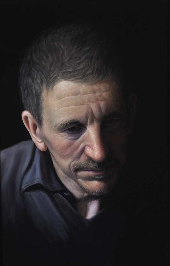
Figure 7 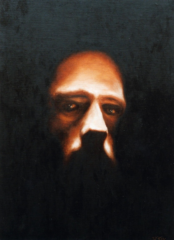
Figure 8
- Figure 7 = Vic Harris, self portrait in oil (2015). Difficult to do a self portrait that isn’t looking directly at you – I guess he used a photograph. Highlights the folds in his black shirt and detail in his dark hair that wouldn’t be seem otherwise. Interesting pose.
- Figure 8 = Valkenburg, Chiaroscuro (2005). Strong light used here to change the atmosphere to one that’s creepy and scary. Not a wide range of tones this time – mainly black and glaring light tone with not much between. The spots of light reflected in his eyes make them really bore into you.
Bibliography (all websites access on 27/8/19)
http://www.nationalgallery.org.uk/paintings/glossary/chiaroscuro
http://www.youtube.com/watch?v=FKwoCkY4Goc
http://www.widewalls.ch/chiaroscuro/
http://www.drawpaintacadamy.com/chiaroscuro/
http://www.artble.com/artists/caravaggio/more_information/style_and_technique (fig 1)
http://www.oldmasters.academy/old-masters-academy-art-lessons/rembrandt (fig 6)
https://www.sothebys.com/en/articles/21-facts-about-rembrandt (fig 6)
https://en.wikipedia.org/wiki/Joseph_Wright_of_Derby (fig 5)
https://www.artistsandillustrators.co.uk/vicharris/artwork/58833 (fig.7)

Fantastic and what art! I am not familiar with these works so they were a delight to see.
LikeLike