
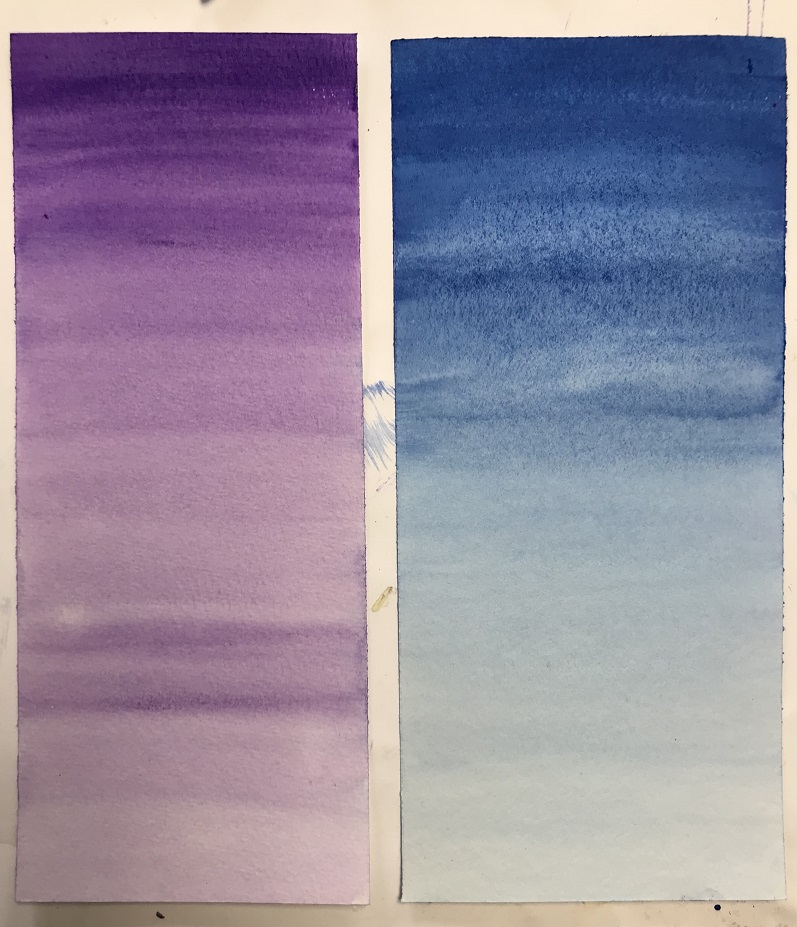
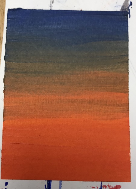
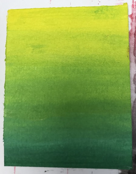
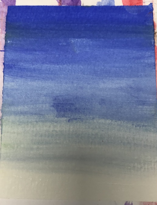
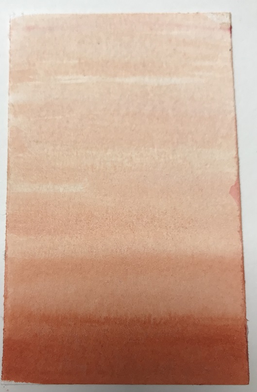
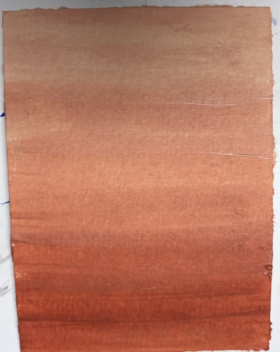
Tonally graded wash and Overlaying washes
Violet and Ultramarine Blue Acrylics

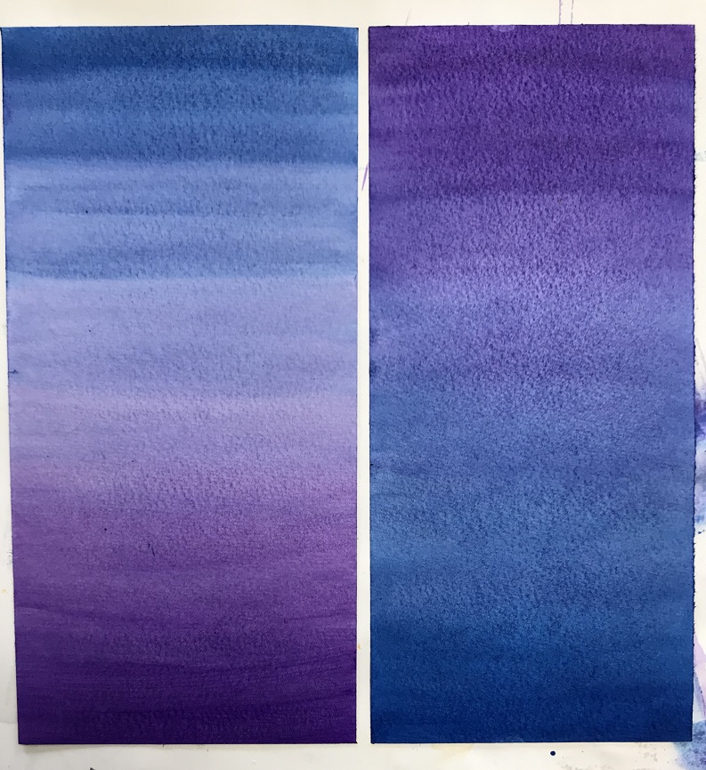
With the wet on wet washes, the colours have blended together irregularly and patchy. There is some distortion where the water has gathered a little. The blending is a little more streaky than on the overlaid glaze versions.
The wet on wet method would be better for skies or water for example where the grading isn’t totally regular and there are patches of one colour or other dominating. The glaze method would be better for anything with regular grading, something man-made such as fabric, it’s far easier to control.
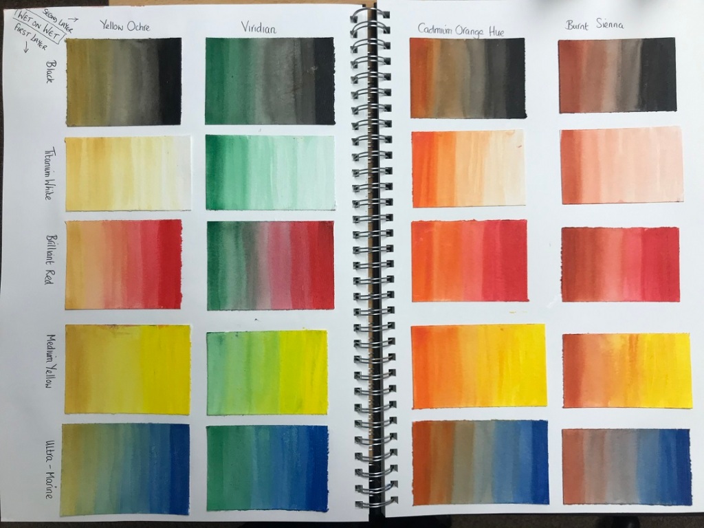
Colours that are next to each other on the colour wheel (eg Yellow with Green or Orange, Red with Orange, Blue with Green) are called Analogous Colours and they blend well together though could get too intense so best if one colour dominates. Those that are opposites (eg Red and Green, Blue and Orange) are called Complimentary Colours and these work very well together with the colours really popping out. The Yellow and Ochre are too close on the wheel and look rather boring together.
All the colours physically blended together well although it’s hard to control how wet the paper gets with wet-on-wet and this makes it streaky and patchy.
https://www.colormatters.com/color-and-design/basic-color-theory
https://www.canva.com/colors/color-wheel/
Glazing is far easier to control and gives a nice regular grading. I’m making the wet on wet too wet and it’s pooling.
Mark Rothko:
https://www.artsy.net/series/how-to-be-an-artist/artsy-editorial-mark-rothko-artist
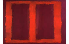
The Seagram Murals are 8 huge works which hang in The Tate in the ‘Rothko Room’. Four are titled ‘Red on Maroon’ and four ‘Black on Maroon’. Viewing these online is totally underwhelming as both the size (they are all several metres square) and colour are completely lost – in fact the images on The Tate website show no contrast between colours on my screen so I started off very confused over their attraction. Thankfully other websites show better images and the beautiful vibrant red ‘frames’ blur as they meet with maroon.


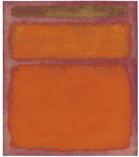
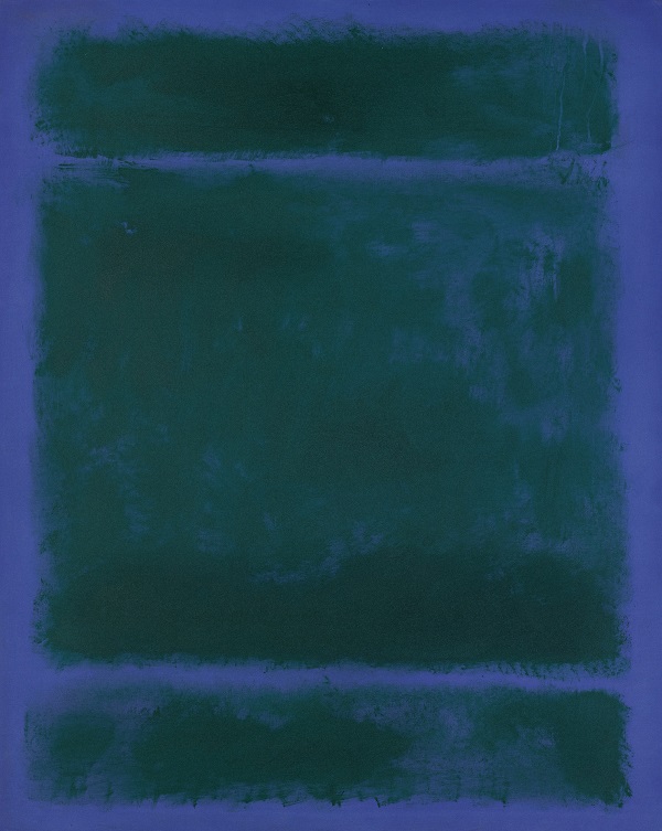
Also used this style of layering colour for many other paintings in various colours, some of which work well together and others that seem to clash.
Opaque Colour Mixing
Paint is termed Opaque when you can’t see through it to the layers below. Some acrylics are more opaque than others eg titanium white and cadmium red.
For this exercise I’m adding white, rather than water, to the colours to try to replicate the grading washes from previous exercises. This should make them Opaque rather than transparent.
Left images = transparent (with water), Right images = Opaque (with white)


Cadmium Orange to Brilliant Red. Pretty close match although Opaque is slightly pinker.

Cadmium Orange to Ultra Marine Blue. The orange is far more vibrant when opaque and rather washed out when transparent. Didn’t manage to replicate colours.


Viridian Green to Brilliant Red. Again the red is a little pink and the green+red+white seems to make grey.

Viridian Green to Medium Yellow. Pretty close grading although transparent green is far more washed out – my fault for adding too much water.

Ultramarine Blue (on own). Very different – the blue changes colour completely (to be more vivid and bright) when white is added.


Viridian Green to Ultra Marine Blue. Greens match well but, as above, the blue is a different colour when opaque.


Burnt Sienna to Medium Yellow. Very close match in colours.
Burnt Sienna (on own). Close match although hard to get lighter tones with white added – I needed to use far more white and less B.Sienna.
A very useful exercise for me – I hadn’t really appreciated the difference between transparent and opaque mixes in acrylics and just how different they can look. The opaque mixes would make great bases for the initial layers. Generally I would think adding transparent mixes towards the end would lift a painting and make it more vibrant and add depth. Opaque can be used to change the colour of lower levels if they are not as wanted, where as transparent can only be used to make subtle changes as lower layers will be seen through.
