Part 4

Project: Working from drawings and photographs

Exercise: Painting from a working drawing

‘a corner of a room or objects on a table by a window’… not feeling inspired by this at all, I’m in the landscape mode and going back to still life and interiors has stumped me rather.

Exercise: Squaring up

This is a method I have used before for the portraits in assignment 3. I had one final portrait left to do of my son Tom but didn’t include that with the assignment since it needed a lot of thought to adapt my style for a male. I have since been working on this and rather than start a totally new squaring up landscape painting, I am going to finish this portrait off instead.

Started with some trial sketches – see sketchbook

This sketch worked best I feel. Using black lines again for the hair as before with the girls, but this time it’s not flowing and loose. Using different width and shaped lines to give impression of hairs and style.

Deciding which colours to use so that it’s vibrant and blends in with the other two portraits whilst still being different from them.

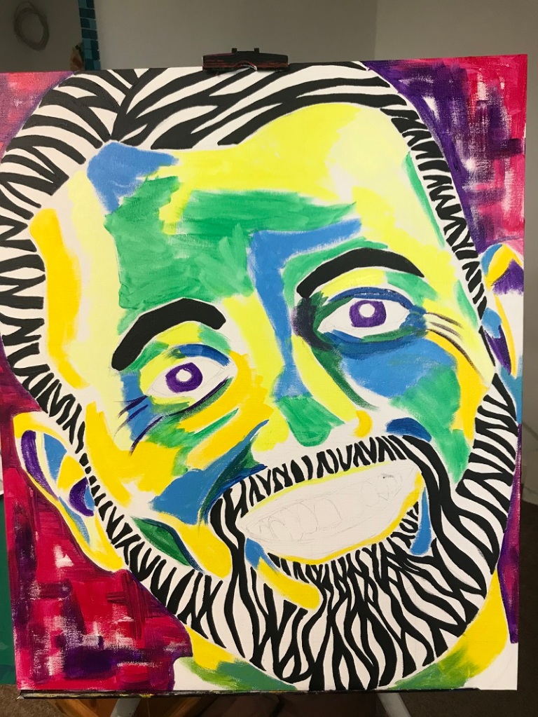
  • Background needs to be less red and more blue/purple to blend better with palette of skin.
  • Keep a little red within skin so lips work but the red beneath eyes is not working at moment.
  • Adjust top line of upper lip which doesn’t match nose line at present
  • White highlights

The squaring up method really works for me with portraits as it gives me the confidence that everything is in the correct place so I can just focus on getting the tones correct. Whether this would be necessary with a landscape or not remains to be seen. My type of landscape wouldn’t need to be totally accurate, in fact it would probably be better having certain parts exaggerated and others reduced/left out.

Exercise: Working from a photograph

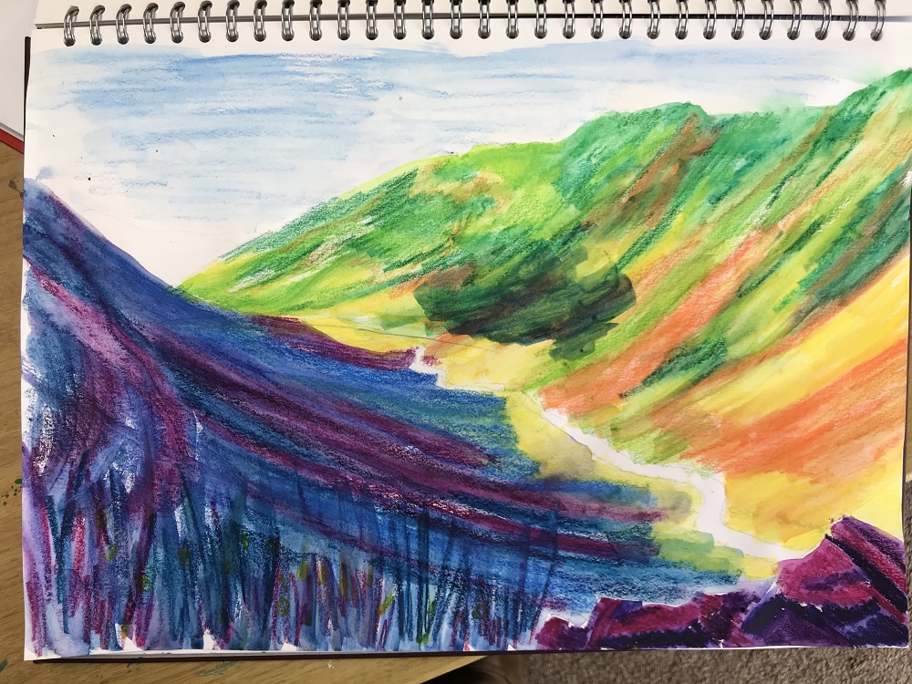
It’s the first decent day today for weeks so I pushed myself to walk up Brentor on Dartmoor to do some sketches of the surrounding valleys – see sketchbook.

This one I quite liked and decided to use it, and the photos taken, for this painting. Tried out several crops:

Large canvas board, 30x20inch, acrylics

Started off with rough coverage of canvas but feeling totally uninspired by it so changed to impasto using palette knives.

A little better but it’s still not going in the right direction. Foreground tree line is beginning to come together – I like the rough texture which brings it forward. Fields are all too green with orangey moorland behind – there is no connection between the two. I think it’s just the wrong composition and nothing is going to make the painting hang together well. There is nothing to take the eye around – no diagonal or features to focus on. Time to give this up and do some research as to what exactly I’m hoping to achieve!

Lorna Holdcroft-Kirin:

I discovered this Sussex artist whilst looking through my books for inspiration. Acrylics on canvas.

Love this last one especially: vibrant yet still realistic colours, some fields lite up by the sun coming through clouds, texture and mark making in the foreground bring that part forward whilst the smoother distant hills are pushed back. Partly abstract with splodges dotted around. Sky takes up top third and diagonal stretch of road covers the bottom third. The road drags your eye backward into the valley.

“I cover the surface with paint quickly to get a sense of colour and tone, and work the whole painting at once. I also use a lot of water, deliberately. This is to wash out areas of semi-dry watercolour or to cause the break-up of pastel pigment.” (Lorna Kirin, Bell Fine Art)

I going to try using lots of water with acrylics (rather than her watercolour as I can’t seem to get on with them) and see what happens – try for lots of runs with thin layers, each left to dry before next coat. Foreground with marks and texture.

Bibliography:

Harrison, H. (2017) The Encyclopedia of Acrylic Techniques: A Unique Visual Directory of Acrylic Painting Techniques, with Guidance on How to Use Them. (s.l.): Search Press.

Landscapes (2017) At: https://lornakirin.com/landscapes/ (Accessed 18/03/2020).

Lorna Holdcroft-Kirin Archives – Bell Fine Art (s.d.) At: https://bellfineart.co.uk/product-category/contemporary-paintings/lorna-holdcroft-kirin/ (Accessed 18/03/2020).

Takahashi, L. (2014) My Deep Passion For Nature by Lorna Holdcroft – Jackson’s Art Blog. At: https://www.jacksonsart.com/blog/2014/02/21/my-deep-passion-for-nature-by-lorna-holdcroft/ (Accessed 18/03/2020).

So I need a different photo/composition to work with. Make sure it has some sort of feature (path, diagonal line, water…)

Lake district photos all of which have diagonals to take the eye back. I’ll have a go with the first one above – Honister Slate Mine. The hills are dramatically steep and there’s lots of contrast between the shaded left slope and the sun lite right slope. The road and stream follow diagonally along the base of the valley into the distance.

Quick watercolour pencil sketch to try out areas of colours – yes I’m happy with this mix. It’s a similar mix to those used by Lorna Kirin in Ditchling Beacon (and others) – blue, purple and pink for areas in shadow; green, yellow and orange for areas in sun.

Canvas Board, 24 x 18 inch, acrylics and water

Lines and splatters in foreground using bit of plastic. Almost there now, road needs more work and small highlights to tree tops.

Much happier with this than my previous try. This composition works. There are clear fore, mid and back grounds. The road leads the eye backworks. My colour palette choice has worked well – it’s vibrant and colourful without being ‘too’ bold and unrealistic. Limiting the colours like this has a more calming effect than my usual riot of colour.

Using lots of water with the acrylics produced some interesting effects. On the left hillside I used a spray at close quarters which washed the paint away leaving that interesting pale area which gives form to the rocks. The drips and runs on the right hill give the appearance of scree patches and add some movement to this steep gravelly slope.

I kept the sky simple using just phthalo blue with some white and dabbing off cloud patches while still very wet with a paper towel. I feel that the result is pretty effective. In future pieces I could use this wet method again but include some more colours for sunsets etc. On my Tenerife landscape painting (ex: hard or soft landscape) I really struggled with making the sky and clouds looks real so this is a definite improvement – remember to keep it wet as with watercolour!

I’m least happy with the road and stream. They don’t appear to being running along the lowest part of the valley. This is because of the way that I allowed the paint to run on the green side. I needed to allow the lowest part of that to run in the opposite direction. Something to make sure I take note of next time.

Foreground has some mark making and brings in colours from around the painting. I need to make this more of a thing – perhaps by allowing the area underneath the marks to be more blurred and washed out with water (as with Lorna Kirin’s Sussex Weald III, Landscape and Friends Clump paintings)

Comparison between photo and painting:

I kept to the same composition as the photo because I felt that it worked for what I wanted and I suppose I was drawn to this photo in the first place because of that.

With this method of allowing the wet paint to run, I couldn’t attempt to copy the ridges and markings of the hillside. This was a fabulous way of keeping me from fussing over detail and keeping it loose. Definitely a method I’ll continue to explore.

I added the feel of vegetation to the foreground which isn’t there in the photo. I wanted to make sure that the viewer felt they were standing on something rather than floating in mid air. As described above, I think I could have tackled this better with more blurring and less details – another thing to explore further.

Standard
Part 4

Project: Painting outside

Research point 2: ‘The Golden Mean’ and ‘Rule of Thirds’

Great, clear explanation in this website:

Scott, D. (2017) Using The Golden Ratio (AKA Golden Mean) To Improve Your Artworks. At: https://drawpaintacademy.com/golden-ratio-in-art/ (Accessed 20/02/2020).

McNee, L. A. (2009) Rule of Thirds – Composition in Art. At: https://www.finearttips.com/2009/04/rule-of-thirds-composition/ (Accessed 15/03/2020).

Exercise: Painting a landscape outside

Easier said than done when the weather has been rain, rain and more rain for weeks on end. Luckily I am going to snowy Lapland for a few days and staying in a glass igloo – it may be far too cold to stand outside to paint but I’m hoping the view from the igloo will be worth having a go with. Going to take watercolours but also a black pad and soft pastels in case there’s the opportunity to catch the northern lights!

Northern Lights! Wow so lucky to be able to see these on a couple of nights. Clouds of swirling green coming and going for about half an hour. Had a go with the pastels which smudge really well and it’s possible to quickly capture shapes as they happen.

Second night, even better: the lights are constantly on the move but the key thing I notice is that the light seems to flow upwards in lines. Frequently a hard line at the lower end which is then dragged upward in swirling patterns. Mainly really fluorescent green and white, but sometimes touches of pinks and purples too. Definite green glow to the horizon. Masses of bright white stars too. How awesome!

Long view over frozen lake to distant forest so much of horizon is visible allowing a large view of the sky.

I particularly like the last two sketches which include a small section of the silhouetted forest seen across the snowy lake in the distance (I added these just afterwards once the lights had calm down but the scene was still fresh in my mind). I brought down touches of the green as reflected in the snow which helps join sky and land together. Also highlights of white on the trees to show they’re laden with snow. This gives more context to the lights and shows their shear size.

Daytime snowy forest:

Quick pencil sketch of the tall pines – doesn’t really capture the depth of the forest but I couldn’t hang around in minus 15deg. Added a few more details from memory once back in the warm but pencil isn’t really the right tool for this.

View of other igloos from inside mine: Later in the afternoon the skies off to the west were beautiful in the low sun and the tall pine trees really caught this light wonderfully. There is only one view of this from my warm igloo so I’m went straight into painting it rather than trying out sketches first. I’ll see what cropping does once it’s finished. Also no time for a second sitting – it could be cloudy on our last day then we’re home.

Sitting on the edge of the bed with hairdryer to hand. Sky first with lots of water and allowed to run. Had to be completely dry before continuing. Used edge of card to make irregular trunk lines and to drag paint around for glass igloos so they’re not too precise. Strong low sun off to the left creating long shadows.

Added the white acrylic splats as snow on the branches once I got home. This was more tricky than I’d anticipated – left side of trees ok as my splats were at the correct angle for the heavy branches (diagonal down from top right to bottom left) but doing the right side meant I had to swap hands to flick the other way – this was when I got some rather large messy splats.

Angles of glass igloos aren’t correct, they should look hemispherical and they also need some dark patches within them to show furniture etc.

I know I wasn’t outside to do this but it certainly presented some of the same problems. Limited resources available and balancing paper and palettes in awkward positions. Had to work fast before the sun disappeared completely. Light changing constantly and having the decide what moment to paint.

Choosing exactly what to paint from the landscape before me was made easier by the fact that one view was the frozen lake and hence not much more than white paint would be needed. The other view was behind to the trees catching the light of the lowering sun. Tried taking some crops of the painting to see if a better composition of the area would have been possible:

Not good, tall tree is too central and chops composition in half.

Just focussing on trees and ignoring buildings – could have worked but needs more trees of varying heights

Like this one of just the trees but including the snow beneath – they feel more grounded and part of a landscape. Overall I feel painting the whole view was the best option: buildings give context, balanced with horizon one third up from bottom, foreground and mid ground (needs some more depth to trees to show distance)

Painting from life really highlighted for me how what the eye sees is so much more vast than a camera. None of my photos show this scene like this, instead everything looks further away and small. A photo wouldn’t include the width either.

Once home I decided to have a go at painting the northern lights from memory – no iphone photo does them justice.

Canvas Board 406 x 305mm. Acrylics: mainly fluorescent green, fluorescent blue, Paynes Grey

Lots of layers trying to get the effect of the light streaming upwards and the colours blending into each other. Found this very tricky!

Lastly added the tree and lake line. Not up at the 1/3 height I know but I felt the sky was the main event here and the ground is just there to give context. Diagonal lines of the lights help take the eye across the page. The lights shining through the trees looks good and that’s how it did look with the horizon glowing. The brush strokes are too visible still so more tries at this would help there. Finished off with white stars and over painted with gloss mediums as the areas of ‘black’ were far more matt than the rest.

Overall, I know I haven’t completed this exercise quite in the spirit of things but hope the weather will change in time for my assessment piece with I hope to do outside.

Standard
Part 4

Project: Expressive Landscape

Research Point 1:

Creating mood and atmosphere with style of landscape

Max Ernst: Lots of foliage, trees, rocks and cliffs used to give height and depth in the weird world he creates. Uses collage and frottage.

Salvador Dali: Very plain, featureless landscapes. Generally no hills but flat ground with objects such as rocks only included for a specific reason. Feels like a different World. A scene from a dream/nightmare.

Giorgio de Chirico: Again a plain, featureless landscape. Lots of straight lines. No unnecessary inclusion of objects or detail which give them a dreamy/other worldliness feel (it isn’t true to the life we know).

Paul Nash: War artist. Scenes of destruction caused by war. Ruins, broken buildings, burnt trees etc. Limited colour palettes of browns and dull, bland colours.

Graham Sutherland: War artist. Very dark tones with hard to make out features and give it a very gloomy, depressing feel (appropriate for war scenes). ‘Black Landscape‘ is a reaction to the artists anxiety at the threat of war.

Emil Nolde: German expressionist. Vibrant, realistic colours giving life and celebrating this beautiful world.

Gustav Klimt: lots of small marks which give them life and movement. Use of colour choice to add vibrancy. Church in Cassone: analogous colours (colours adjacent to each other): of blue, green, yellow. For Orchard with Roses: complementary colours (opposites) of red and green. Feeling of summer and heat, life and energy.

Bibliography:

Bonhams : MAX ERNST (1891-1976) Ohne titel (Sedona Landschaft) 18 1/2 x 23 3/8 in (47.1 x 59.5 cm) (Painted circa 1957) (s.d.) At: https://www.bonhams.com/auctions/24046/lot/24/ (Accessed 15/02/2020).

Emil Nolde (1867-1956) , Herbsthimmel am Meer (s.d.) At: https://www.christies.com/lotfinder/Lot/emil-nolde-1867-1956-herbsthimmel-am-meer-5615574-details.aspx (Accessed 15/02/2020).

Emil Nolde * – Modern Art 2017/11/21 – Realized price: EUR 81,250 – Dorotheum (s.d.) At: https://www.dorotheum.com/en/l/399670/ (Accessed 15/02/2020).

Gustav Klimt Landscape Paintings (s.d.) At: http://www.gustavklimt.net/landscapes/ (Accessed 15/02/2020).

Italian piazza by Giorgio de Chirico: History, Analysis & Facts (s.d.) At: https://arthive.com/giorgiodechirico/works/394266~Italian_piazza (Accessed 15/02/2020).

Kane, T. (2014) De Chirico and his Fantastic Landscapes. At: https://timkanebooks.com/2014/07/08/de-chirico-and-his-fantastic-landscapes/ (Accessed 15/02/2020).

Max Ernst: 50 Famous Paintings Analysis and Biography (s.d.) At: https://www.max-ernst.com/ (Accessed 15/02/2020).

MoMA | Salvador Dalí. The Persistence of Memory. 1931 (s.d.) At: https://www.moma.org/learn/moma_learning/salvador-dali-the-persistence-of-memory-1931/ (Accessed 15/02/2020).

Salvador Dalí: Moments of Transition on Sotheby’s Blog (s.d.) At: http://www.sothebys.com/content/sothebys/cn/news-video/blogs/all-blogs/impressions/2017/02/salvador-dali-moments-of-transition.html (Accessed 15/02/2020).

Solitary and Conjugal Trees (s.d.) At: https://www.museothyssen.org/en/collection/artists/ernst-max/solitary-and-conjugal-trees (Accessed 15/02/2020).

Tate (s.d.) ‘Black Landscape’, Graham Sutherland OM, 1939-40 | Tate. At: https://www.tate.org.uk/art/artworks/sutherland-black-landscape-t03085 (Accessed 15/02/2020).

Wikipedia contributors (2020) The Menin Road (painting). At: https://en.wikipedia.org/w/index.php?title=The_Menin_Road_(painting)&oldid=934395614 (Accessed 15/02/2020).

Exercise: Creating mood and atmosphere:

For this exercise I have decided to rework my first painting of this section – “View from a window or doorway”. I was happy with the composition of this piece but very disappointed at how tight and illustrative it turned out to be.

This was very much a summer version of the view from my kitchen window. I used yellow, blue and their secondary colour, green to give vibrancy and life. However I hate all the line work and preciseness – it’s so hard to keep it loose and abstract!

So I’m going to have another go and this time attempt to not only keep it loose, but also to change the mood so that it appears to be winter (ie more realistic as it’s now February). I need to keep the colours muted and dull, none of the brightness that I’m always drawn to.

Canson mixed media paper, A3

Water colours: Olive green, burnt sienna, sap green, med yellow, payne’s gray, raw umber

I started with the window frame, determined not to draw in lines this time. I wetted the whole area and painted with payne’s gray. Then I used a piece of credit card to drag the paint around allowing it to puddle in the more shaded edges of the window frame (as for initial life paintings in Part 3). The residue of paint left inside each frame works well giving a look of the wobbly old glass. I continued used the credit card and a stick to paint the outside view – no flowers this time. I left the decorative pattern off of the curtains and instead attempted to show the areas of light/shadow by dragging the paint again. The chair was very tricky – it is bright yellow but I needed to tone it down. Really struggled getting the form correct and it looks flat despite trying to darken the shades areas. I did remember to leave out the left arm rest this time as I got the perspective wrong here on my first attempt.

Glad I tried a totally different method of applying the paint this time. The result is certainly different from before and looks more wintery and dull. It’s also looser and less illustrative. Don’t like it still and I’m thinking that it’s because I have no skill at watercolour techniques. I should find a class to attend but it just doesn’t suit my style so I’ve no enthusiasm – need to focus more on acrylics when time allows.

Standard
Part 4

Project: Perspective

Exercise: Linear perspective

Chipping Campden, Cotswolds. Only paper available is a large pad of flimsy flip chart paper in the pub I’m staying at, oh well, worth having a go at sketching this beautiful street.

My horizon line is just above the head of the person walking down the street – the road slopes slightly downwards. Luckily there’s double yellow lines on the road here so no parked cars, they would be hard to draw! Included the stone work of the buildings closest to me but really focussed on just getting the outlines down on paper.

Brought the sketch home and added some loose watercolour. Certainly not ideal paper for watercolour so having to use less water than usual and keep it light. Keeping palette to Paynes Grey, Burnt Sienna, and Raw and Burnt Umber, and yellow. I used marking fluid for the double yellow lines down the street hoping that I’d be able to get it off without destroying the paper and then paint them yellow. However, definitely not going to come off and since the fluid is yellow and has given quite a good line effect I’m going to keep it.

Have I achieved linear perspective? I think so. Buildings getting smaller into distance, lines of roof ridges, windows etc sloping towards horizon. Footpath on the right helps a lot as it is pointing straight up and away from me getting narrower the further away it is. Horizontal lines of the stonework also help take the eye backward.

As I was using pen to sketch this, there are various lines which are out eg the horizontal lines of the nearest window on the left.

Exercise: Aerial perspective

I used a view remembered from a trip last year where I was at a high vantage point overlooking a landscape of mountains fading away into the distance.

A3 mixed media paper. Decided to have a bit of a play with this piece and started by putting down some texture. Modelling paste in the foreground, torn cardboard for large rocks, tissue paper scrunched for mid ground mountains, nothing for far distance. Dried with hairdryer – I want to get this one finished today.

Used Anilinky (vibrant water colours) for the sky and dabbed with tissue to give clouds. Lighter at horizon.

Also Anilinky for the distant mountains with just a touch of tonal variation to show they have form.

Covered rest of page with Anilinky to mask the whiteness, allowing paint to run and drip as it follows texture. Needs more – used watered down acrylics for a second layer, as they have more body, to run over the textures again. Better now.

Foreground has to have more detail in order the show perspective. Allowed drips to run down from the bottom edge to give grasses/vegetation – yellows and browns. Once dry, I also splattered dots of paint in foreground.

At this point I almost decided it was finished enough but then came back to it:

Now it’s finished. I used soft pastel to highlight the textures of the midground and blended colour into the central valley (hard to tell on this photo). I also used pastel to soften the most distant mountains as if covered by a light layer of cloud.

I seems to me that the main devices for creating aerial perspective in this piece are the loss of focus into the distance (ie less and less detail) and also the loss of colour saturation into the distance (ie colours becoming muted and faded). I tried using more warm colours in the foreground, and cold in the distance but I’m not convinced this worked for me. My colour choices could certainly have been better – the pink in the mid ground would have been better being more red/orange as the foreground rather than added yet another colour to confuse the eye.

I enjoyed playing with the textures. I need to collect lots more scraps to use for this though as I was quite limited (eg textured wall paper and packaging). More playing around with allowing the paint to run is needed – I must stop constantly changing the direction of run and allow it time to do its thing! Fun experimenting though.

Standard
Part 4

Project: From inside looking out

Exercise: View from a window or doorway

Raoul Dufy (1877-1953)

French fauvist artist, decorative and colourful paintings. Usually included part of the interior with his window painting. A touch of the Van Gogh interiors here in his use of outline and perspective. Also Matisse. Love this style, definitely one I’d like to have a go at.

The Window at Nice, 1923

Gwen John (1876-1939)

Welsh artist, sister of the artist Augustus John. Very dull and gloomy paintings, lifeless. Not for me.

A Corner of the Artist’s Room in Paris, 1909

Edward Hopper (1882-1967)

American artist, realist paintings of modern American life. Lots of preliminary sketches for oil and watercolour painting.

Room in Brooklyn, 1932, oil on canvas
Morning Sun, 1952

Pierre Bonnard (1867-1947)

French, many versions of views from windows. Focus is on the play of light. Bright but realistic colour .

Henri Matisse

French, fauvist, limited but striking colour palettes

Bibliography:

Dining Room on the Garden (1934) At: https://www.guggenheim.org/artwork/605 (Accessed 27/01/2020).

Dufy, R. (s.d.) Window Opening on Nice – DUFY, Raoul – Google Arts & Culture. At: https://artsandculture.google.com/asset/window-opening-on-nice-dufy-raoul/kgHGmOYFUi5jbQ (Accessed 27/01/2020).

Quiet intensity: the life and art of Gwen John | Art UK (s.d.) At: https://artuk.org/discover/stories/quiet-intensity-the-life-and-art-of-gwen-john (Accessed 27/01/2020).

Raoul and Jean Dufy at the Musée Marmottan Monet (s.d.) At: http://www.artfixdaily.com/blogs/post/579-raoul-and-jean-dufy-at-the-mus%C3%A9e-marmottan-monet (Accessed 27/01/2020).

Raoul Dufy – 161 artworks – WikiArt.org (s.d.) At: https://www.wikiart.org/en/raoul-dufy (Accessed 27/01/2020).

Red Interior, Still Life on a Blue Table, 1947 by Henri Matisse (s.d.) At: https://www.henrimatisse.org/red-interior-still-life-on-a-blue-table.jsp (Accessed 27/01/2020).

Stanska, Z. et al. (2017) Edward Hopper’s Drawings That Will Blow Your Mind – DailyArtMagazine.com – Art History Stories. At: https://www.dailyartmagazine.com/edward-hopper-drawing-famous-paintings/ (Accessed 27/01/2020).

Wikipedia contributors (2019) The Open Window (Matisse). At: https://en.wikipedia.org/w/index.php?title=The_Open_Window_(Matisse)&oldid=918521155 (Accessed 27/01/2020).

Wikipedia contributors (2020) Edward Hopper. At: https://en.wikipedia.org/w/index.php?title=Edward_Hopper&oldid=937789280 (Accessed 27/01/2020).

I’m drawn to the painting above by Raoul Dufy – the use of bright primary colour in a loose and slightly abstracted way. He uses rough brush outlines fulled with colour, not a lot of tonal variations just blocks of colour. The same blue is used for the sky, sea and table. The same red for the roofs, carpet and mirror reflection. The composition is balanced with a central mirror and plant, on each side of which is a large french door onto the coastal view. Then yellow and blue stripey wallpaper and a chair completes the painting on both sides. There is no fuss over total accuracy; lines are not straight, the right hand chair doesn’t sit quite right with the base of the door, only the right hand door has any depth to it…

For this exercise, I’m going to give this style a go. A happy, sunny, carefree atmosphere created with colour and simple, unfussy layout. I’m going to take the main elements of the view but not stress over a realistic representation ie positions changed if necessary, colours adapted, detail left out, whole window opening onwards to show a clearer view of outside (it doesn’t really open that way). I will include the window frame and a small area of the internal room to help set the scene.

Tried out a few sketches of composition and settled on the second one above – including the chair and curtains gives it more context, the open window allows a better view of the outside, window viewed from an angle to give diagonal perspective (check the horizontal window line angles, they don’t look quite right – eye level is about top of lowest pane which should therefore be horizontal, bit of an angle for window sill then but more for top of window…)

Would like to give this a go in water colour or gouache but I also need the colours to be vibrant and bold. After trying out several pens to see which really can be overpainted without smudging, I settled on using drawing ink and nib pen. The infill colour will be Anilinky Paint (vibrant water colours) along with acrylic inks. I’ll keep the palette limited and just use blue and yellow along with their secondary mixes.

Initially I was quite pleased with this, feeling that I’d captured the view well, perspective is ok, composition works and it’s balanced. Colours sit well together and it’s vibrant. I’d managed to create a light, cheery atmosphere out of the gloomy winter scene that I was looking at. All good, however…

Now all I can see is a tight, illustrative painting, full of accuracy but no life or interest. It was supposed to be far more abstract! My initial ink line work is far too fine – I should have used a small brush so that I got irregular line thicknesses. Perhaps if I’d used bigger paper (this is 30x40cm watercolour paper) and a long handled brush held at the end rather than hunching over the page and working slowly and carefully. Plus, the left arm of that chair should point outwards more rather than being parallel to the right arm. Not happy with myself – one to do again, time allowing.

Reworked this: see Expressive Landscape

Exercise: Hard or soft landscape

During a recent trip to Tenerife, I made the following quick sketch while sitting in a cafe on the top of a mountain overlooking the very windy road we were travelling along. The low evening sun was behind the mountains to the right making sharp tonal contrasts between those areas still in sunlight and those that were not.

I had decided that I wanted to continue with the fauvist / bright coloured theme and remembered an artist I’d come across during Drawing 1 called Scott Naismith. I looked his work up again along with a couple of others artists and studied how they had used colour in their landscapes. See sketchbook.

Scott Naismith had painted a view of Applecross Pass in Scotland with its windy road snaking across the mountains so I decided to use this as inspiration and try my own version using the Tenerife Mountains.

I’ll use the sharp contrasts between light and shadow to add intrigue and interest. Lighter tones will be yellow, orange. Areas in deep shadow will be dark purple, blue and black. I need to remember to keep my mark making quite gestural and loose – I struggle with doing this. Try bigger brushes and holding them toward end…

To create a sense of depth within the landscape I’ll need to add more detail and colour in the foreground. The distant mountains need to be without detail and a lighter tone.

Canvas board, 762cm x 508cm (20x30inch) which allows for a wider landscape than you’d get from the usual A4 proportions. Acrylic paints as I love their vivid colours and quick drying which allows faster working.

Gradually building it up. Sky definitely needs reworking but I’m finding it hard to recreate the type of clouds seen in Scott Naismith paintings. Lots of colour, rounded fluffy shapes – I’m not sure what brush I should be using but trying a big mop head now, still getting too many ‘marks’… Also I need to make it clearer that the sun is setting to the right behind the mountains.

Finished?

I think I’ve achieved a good sense of contrast between light/dark tones and the mountains appear 3 dimensional. Far distant hills are lighter toned which adds to the sense of distance.

Still not happy with the sky but it’s better. Obviously something I need to really look at and see how others achieve realistic clouds.

I’m not sure that the foreground has worked either. Tried to show a sense of low vegetation in a very loose, abstract way but I’m not convinced by my mark making. Have I tried to make it too bush like? Perhaps just ‘marks,’ as Scott Naismith uses, would be more effective?

Overall, I’m satisfied that as my first landscape in this style, I’ve made a good start onto which I can improve. I’ve achieved the essence of the landscape I hoped for – now for lots of experimenting and research to improve the technique.

Standard
Part 4

Writing a Review

Exercise: Writing an Exhibition Review

Landscapes of The Mind: The Art of Tristram Hillier

The Museum of Somerset 9 November 2019 – 18 April 2020

A small exhibition featuring about 50 paintings acquired from both private collections and national galleries. This is the first time in 30 years that it has been possible to get a collection of Hilliers work together allowing us to rediscover his realistic, yet highly symbolic, landscapes.

Born in 1905, Hillier spent his childhood in England followed by many years in France, Spain and Portugal until settling in Somerset after WWII. His father died when Hillier was just 19 freeing him to follow his passion for art instead of a business career.

In 1934 he joined a group of artists known as ‘Unit One’ who focussed upon abstract and surrealist art. The group, including artists like Barbara Hepworth and Henry Moore, would heavily influenced his work.

The exhibition cover his whole career right through from the 1930s to 1980s and is presented in chronological order interspersed with boards explaining each new phase. The layout is such that the visitor can easily navigate around the paintings getting a clear feel for how they developed over the years in line with his life and the changing World.

He was greatly influenced by the landscapes around him and loved to paint scenes from his travels to Europe. His realistic style is littered with symbolism relating to the effects of war, his own feelings and the fears for his family living in such troubled times. He would draw accurate sketches that he would then take back to his studio in England to paint. His meticulous study of fine detail and the textures around him bring life and interest to his landscapes. For example, in The Beach at Yport (1940), there is extraordinary detail on the netting and the brick wall in the mid ground. However the foreground rocks are almost featureless with the minimum of tones used to imply form. This combination ensures that the painting isn’t too precise and retains its dreamlike quality.

On first glance, The Vale from Cucklington (1944) depicts the usual idyllic scene of an English country church within the green countryside. However this was painted during WWII and you quickly notice that all is not as it should be with the landscape appearing rather neglected with broken gate and branches littering the road. Similarly, January Landscape (1962) shows an English countryside scene painted later in his life when in the depths of depression. Many of these later paintings lack the joy for life of earlier works, using a less vibrant colour palette and bleak compositions. This painting shows a long road ahead lined with featureless hedges and bare trees – a mirroring of his depressed state of mind.

The detail in each individual stone in the wall to the left in January Landscape is beautiful – the shadows, grooves and chips, the subtle variations in colour. Equally the bare trees show in phenomenal detail each branch and twig wonderfully backlit by the low winter sun. After exploring the composition as a whole and following the long road into the distance, you’ll find that you just have to go back to examine all that detail.

An informative and well curated exhibition, well worth a visit.

Bibliography:

Landscapes of the Mind: The Art of Tristram Hillier (2020) [Exhibition]. The Museum of Somerset, Taunton. 9 November 2019-18 April 2020

Hillier, Tristram Paul, 1905–1983 | Art UK (s.d.) At: https://artuk.org/discover/artists/hillier-tristram-paul-19051983 (Accessed 21/02/2020).

Tate (s.d.) Tristram Hillier 1905-1983 | Tate. At: https://www.tate.org.uk/art/artists/tristram-hillier-1288 (Accessed 21/02/2020).

Tristram Hillier (s.d.) At: https://www.nationalgalleries.org/art-and-artists/artists/tristram-hillier (Accessed 21/02/2020).

(Word Count: 524)

Standard