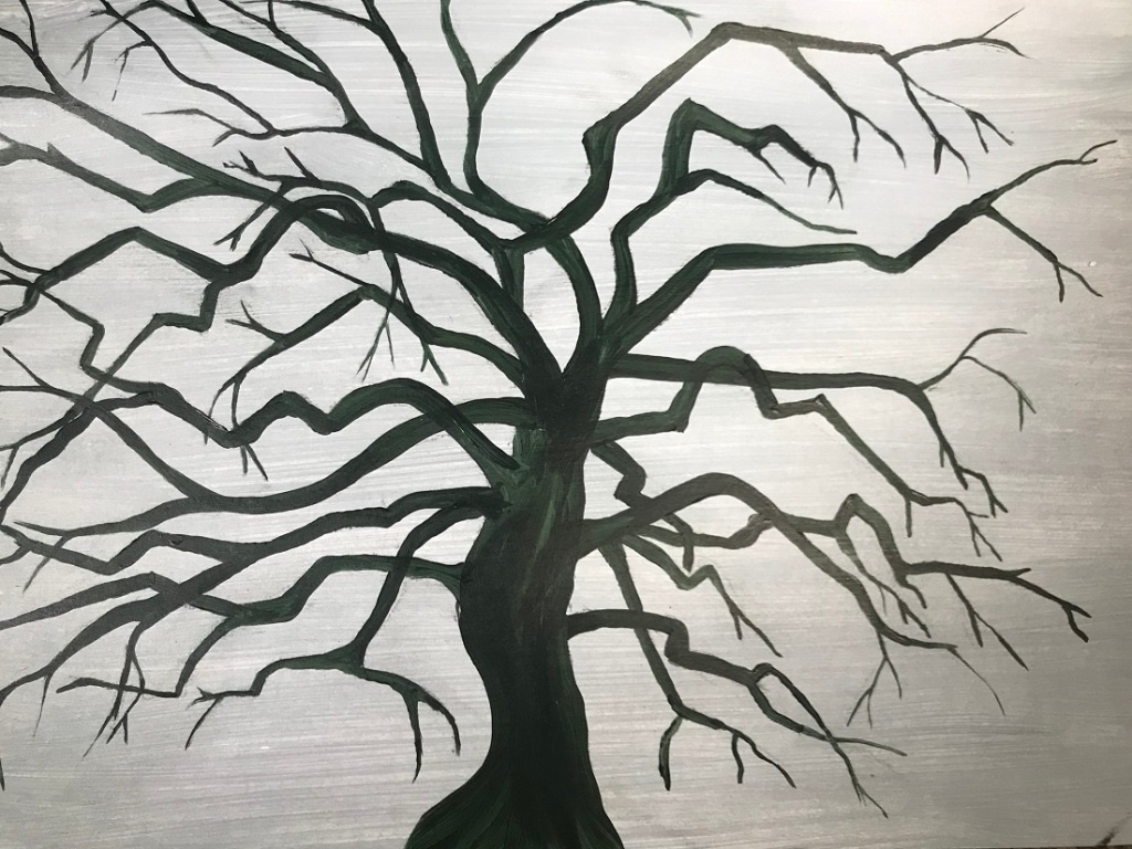
It wasn’t until I had completed this exercise that I understood what it was about! The light grey includes white and is therefore Opaque, and the dark tree colour is a transparent wash.


It was incredibly tricky painting the negative spaces. It was hard thinking about where each branch was and I managed to paint over a few. My white acrylic is obviously rather poor quality as it took 2 coats to make it semi opaque – you can still see through to the background and clearly see all the brushstrokes as well. However, now that it’s finished I find that I prefer it to the first one. There is far more life and movement and seeing the brushstrokes adds to this effect. The trans on opaque is rather boring and lifeless. It’s also interesting to note how the branch shapes vary between the two with the lines being more angular on the second (tendency to leave a straight edged gap for the twigs rather than small bends and flicks).
Interesting how the background brushstrokes are so clearly visible on the second tree. I ran the strokes horizontally not thinking at all about the effect. This gives the tree trunk some weight and a suggestion of being rounded. I think vertical strokes would have elongated the tree and given the suggestion of height – an interesting point to consider for futures pieces that the brush stroke direction for the ground could still matter.
I didn’t do the fading in tone for the outer branches and twigs – I found it tricky enough without that extra complication. Next time.
Note to self that I must get a quality fine hair brush.
I would have automatically gone for painting the tree onto the background. This exercise has definitely open my eyes to the fact that it doesn’t have to be done like that and painting the negative spaces could add required movement and life – don’t just do the obvious!
