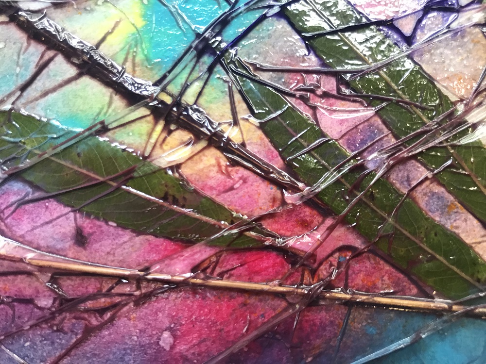
Abstract scene using watercolours, drawing inks, leaves and cling film to give blending and impression of textures.
Thoroughly wet paper (which is masking taped to board)
Working quickly so it doesn’t dry – Add watercolour patches randomly, allowing them to blend together
Place leaves, ferns and grasses into paint – must be relatively flat, not thick glossy leaves, lots of texture good
Ensure paint is still wet, spray if necessary
Cover with cling film, press down and accentuate the crinkles and wrinkles.
using a pippette – drip drawing ink down under cling film and encourage it to run into the creases to give lines and veins by tipping paper
Allow to fully dry (a day or two) like this, add weight on top if needed to press cling film down
Remove cling film and leaves
with cling film on and waiting to dry…
when dried and cling film/leaves removed
Note how much lighter the watercolours are once dry – something I’ll need to remember and be aware of.
Love the textures, patterns and lines this has made. Could be useful as a background method. Also could try this on a portrait A3 paper, watercolour a blue cloudy sky in top half/third, then use this method for landscape on bottom part, leaves and foliage in foreground….
To be continued…..
Session 2:
For the Sky: Ultramarine Blue, Phthalo Blue, Lemon Yellow. Use wet and allow to run.
Then quickly scrape back the paint off the tree trunks using a credit card.
Paint on bark using credit card – dark on one side, light the other.
Faint shadows on snow.
Paint in trees on the skyline, keep the line rough.
Artists of the Tamar Valley opened their studios. Highlights for me were:
Roger Pyke (Callington), acrylic and mixed media incorporating relevant text (sometimes on edge of canvas). Uses photographs of local areas – perhaps projecting onto canvas? Artist not available to ask. Lots of textures.
Oonagh Glancy (Callington), sugarlift and ink. Spoke to artist at length – uses Drypoint etching initially for her main black outlines and then uses a cardmaking press (cheap) to print several copies. She then adds detail in ink making each copy slightly different. Also uses ‘Sugarlift’ and ‘Aquatint’ processes (see this site for what they mean: http://www.blogmuseupicassobcn.org/2015/07/sugar-lift-aquatint-by-pablo-picasso-the-delicacy-of-the-etching-of-pictorial-effects/?lang=en ) Also uses a quicker and easier method of etching using sheets of acetate which she scratches her marks onto (rather than metal plate) and then prints off those – only works for a couple of prints though.
Joely Swift (Callington), stitched felted silk. Beautiful landscapes with textures eg the rock columns which stand out. Irregular shaped supports = more organic.
Paul Jeffries (Callington), mixed media. Rather muted colours for me but the textures are magnificent – carefully placed and work so well for the rough rock cliff faces.
Rosemary Wood (Callington), mixed media. What was astonishing was her vast range of materials and techniques used – textiles, collage, resin, drawing, printing. She said she loved to play and didn’t want to settle on one style.
Jackie Lowman (Gunnislake), mixed media. Uses acrylic inks because she loves ‘their jewel like colours’ (Jackie Lowman). I agree, I love the vibrancy they give and found myself constantly returning to use them in Drawing 1. Colour was the main focus of some of her work – woodland silhouettes over sunsets of vibrant reds and oranges. Others were landscape scenes incorporating found seeds, leaves, bark etc. And this mystical piece of ruined buildings high in the forest – imagine your own dream story for this one!
Allie Cole (and other artists at Calstock). Prints of organic shapes, very clean and neat. Some including fabric (as above). Also Hot knife fabric cutting being demonstrated – looks like a soldering iron but with a point end – uses it to join coloured silk fabric strips together to make abstract arrangements to put on cards. Quick line will melt fabric enough to join together, slow line will cut through ie can cut shapes through some layers and leave lower layers.
Colin Pethick (Gunnislake), oils. Colin has recently been on Portrait Artist of the Year (Channel 4) so it was great to have the opportunity for a proper chat with him in his studio. He had just begun a 1 hour portrait in oil and the likeness, especially around the eyes, was already there. He says to always use the largest pallet possible so that you’re not tempted to skimp on putting out the paint. Rarely rinses brush, just wipes quickly on rag. Uses large brush strokes, doesn’t fuss over them, if they’re not right it’s easy to go over. Uses swipe of finger to soften paint when too bold. He runs classes on fridays in this studio and has spaces! Definitely giving that a go.
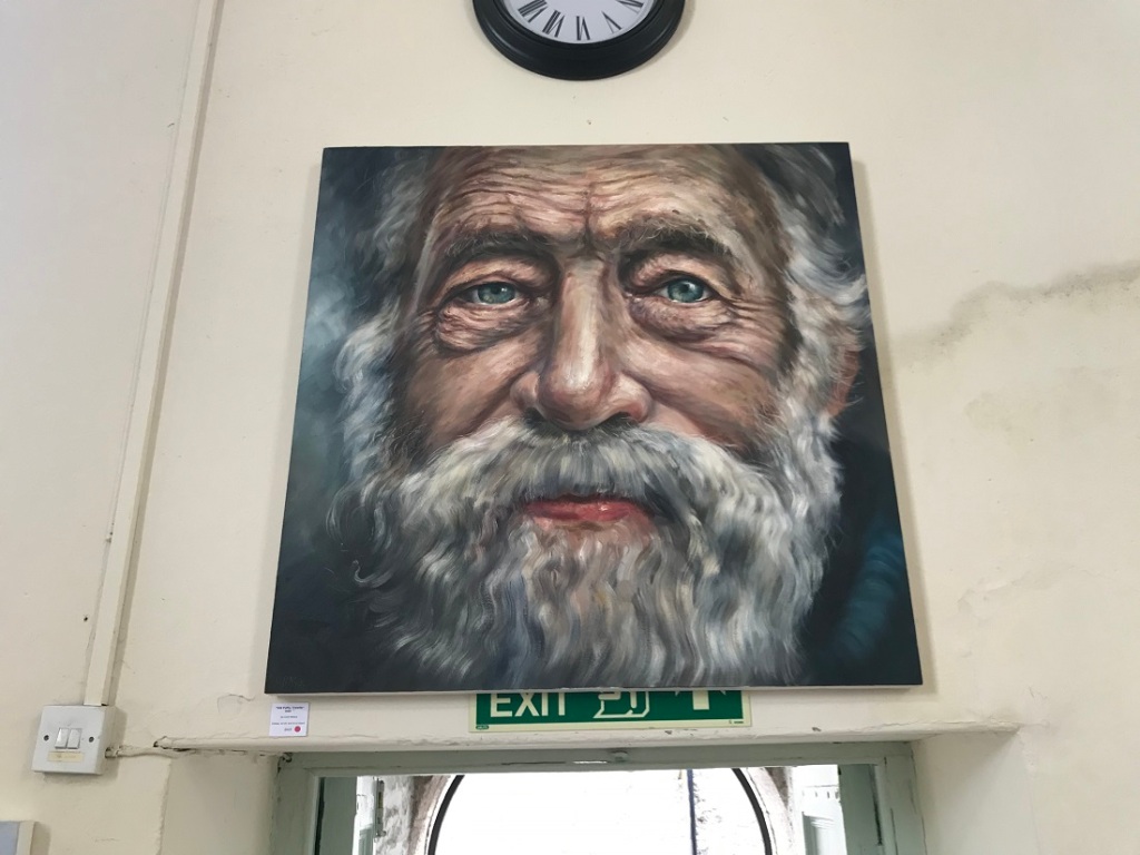
Large portrait of a local fishman above doorway. Skin really looks weathered and textured. He has painted the lower eye lids watery – makes them so real.
Absolutely love this ‘simple’ still life of coffee pot and lemon. Great study of the reflections in the metal and also on the table. I need to find a coffee pot and have a go at this.
Just some of the highlights of my visit on 8th August 2019 are:
1.Thomas Houseago, Large Walking Figure 1 (left) and Untitled Red Man (right), bronze
Both enormous sculptures of intriguing humanoid figures, rough castings with finger prints still visible. Enlarged feet and hands, skeletal face.
2. Alexander Mochalov, Rachmaninoff: Piano Concert No. 2, Oil
Abstract and mosaic-like, black outlines Full of things beyond the orchestra that you don’t at first notice: children, bells, a couple of horses, a snake and a man with a spear. I guess these relate to the underlying meaning of the music but even with a quick google I’m none the wiser.
3. Alison Watt, Entente, Oil
Incredible use of tone variation to paint what looks like a real piece of folded paper – wow!
4. Alselm Kiefer, Five years Vainamoinen lived on the unknown island on the treeless land (translated from German) (left) with detail (right), mixture of paints
Enormous piece with limited pallet, german wording included and texture. Like a field after harvest with plant spikes in lines leading the eye off into the distance. Certainly gives the feel of the bleak barren land of little hope.
5. Anthony Green, Mary and her Mother – Parkinson’s (left) and Mary Cozens-Walkers’ World (right), both Oil on board
Several pieces by this artist which are easily recognisable by their pallet of golds and oranges. Very sensitive portrayal of the lady with her personal possessions around her. Left piece is layers: 2 boards with a small window in the front one to view the one behind we can also look around the edges. The right piece particularly interested me as it uses multiple perspectives of the room in a similar way to my Drawing Assignment 2 (link below). Love how he has used an irregular shaped support and added the door and picture from the wall behind the painter.
6. Christopher Oldfield, Graduation (with detail on right), Oil
Intriguing; we start with 2 figures (or is that a third on the left?) smiling at the viewer, these than blur as if a ghostly figure has taken them over by the last frame. Spoilt for me by the highly glossed layer over the paintings which detracts from the images, like viewing through glass.
7. Ed Gray, Silicon Roundabout, Old Street. Acrylic, Ink, charcoal and chalk on board.
A busy street of people going about their own business. Figures are almost skeletal. Limited use of mid tones – all dark or light. White outlines to distinguish detail in places. Perspective skewed on left side to include the view further down the road.
8. Emily Allchurch, Babel Britain (after Verhaecht), transparency on LED lightbox
This piece stood out from all the rest within the room with its illuminated sky and water – the wonders of using a lightbox. A thought provoking composition deserving a longer detailed study to spot all those little details (castles to tower blocks to car parks, flags and cranes, every type of building materials possible…)
9. Grace O’Connor, Blonde on Blonde, Oil
A scrap book style poster wall of blondes – all painted though and the tape isn’t real either. Beautifully done, I guess painted from a real wall.
10. Hilary Paynter, Herculaneum, Wood Carving
I was drawn to this before looking up its title and thought it must be these Roman ruins in the shadow of Mt Vesuvius – the city as was complete with harbour arches, overlooked by the city of modern buildings and with the towering volcano behind in silhouette. Very detailed and planned out. Recognisable yet not true to life.
11. Ishbel Myerscough, Lily and Quaye, Oil (cropped detail on right)
Beautifully realistic painting of skin tones against silky background. Not sure about the overall composition myself, too predictable? made to fit the canvas with feet and head touching edge? I love the contrast of the dark skin against the white belly – perhaps a crop as above would work better.
12. Marcus Harvey, The Victory, Oil on inkjet on board
Photo of sea and sky with painted ship. Abstract images used to make up the ship – female figure, letters A and D, icy spikes and round shield like shapes. Would love to know what it all symbolises.
13. Melissa Scott-Miller, Islington Back Gardens with Self, Oil
Interesting composition of a view usually unseen of peoples private gardens. And viewed from a high point looking down on the artist herself. Makes you feel that you’re really being nosey and looking into their gardens without their knowledge.
14. Mimmo Paladino, Untitled, bronze
Imposing figure holding a branch and tangle of wire containing numbers – why? this is one piece that definitely needs a title!
15. Nicola Bealing, Darn, Ink Oil and spray paint on linen
A darn as in a sewed patch to mend a woolen item but it’s actually snakes! Good use of light and tones to make bodies 3D and real. Each pattern different. Snakes and Ladders. Great composition combining real and abstract.
Chiholy Glass Exhibition at Kew Gardens:
Spectacular display of blown glass by Dale Chihuly. The enormous size of each piece is it’s real attraction together with the vibrant colours of the glass. Base colour attached to rod and blown a little then rolled in granules of each contrasting colour in turn. Granules used so as to give the irregular variation in tones (through thickness of glass). Settings used to really shown each piece off to best effect: red/orange rods like flames in wild grasses, spheres in raked gravel, huge string of flowers hanging from glasshouse roof and intricate shells of cups within cups well lite in spotlights.